Vivian Westwood Exhibition-Truly Phenomenal!
Have you ever attended an event, that has simply left you speechless? This is how I felt when I visited the Vivian Westwood Exhibition, but I’ll try my best to put into words the experience. Also, in no way do the photos do this exhibition justice, but hopefully gives you a bit of an idea of the jewellery creations on display.
Exploring the Vivienne Westwood Jewellery Exhibition at Te Papa Museum in Wellington, New Zealand.
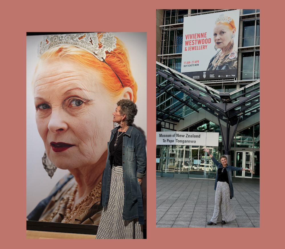
As a jewellery designer deeply inspired by the fusion of art, culture, and fashion, visiting the Vivienne Westwood Jewellery exhibition at Te Papa Museum in Wellington, New Zealand was an experience that inspired my creative spirit! This exhibition offers a comprehensive journey through the evolution of Westwood’s iconic jewellery designs, reflecting her influence on fashion and culture over the decades. (If you’re not familiar with Vivian, simply google her and you’ll find a wealth of information!)
Here is the hotlink to a video clip showing the exhibition-Worth Watching! https://www.nomadexhibitions.com/sustainable-touring-exhibitions/vivienne-westwood-and-jewellery
A Glimpse into Vivienne Westwood’s Legacy
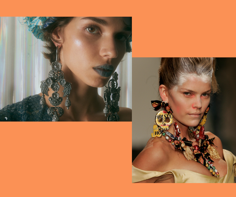
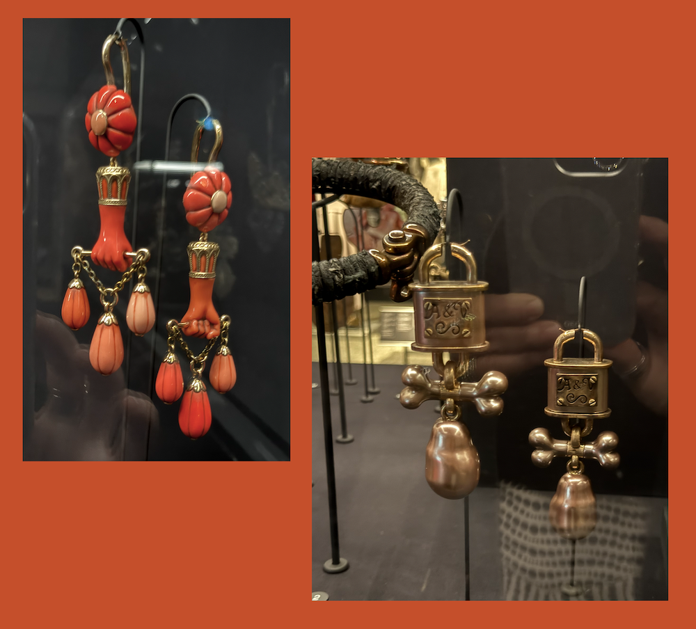
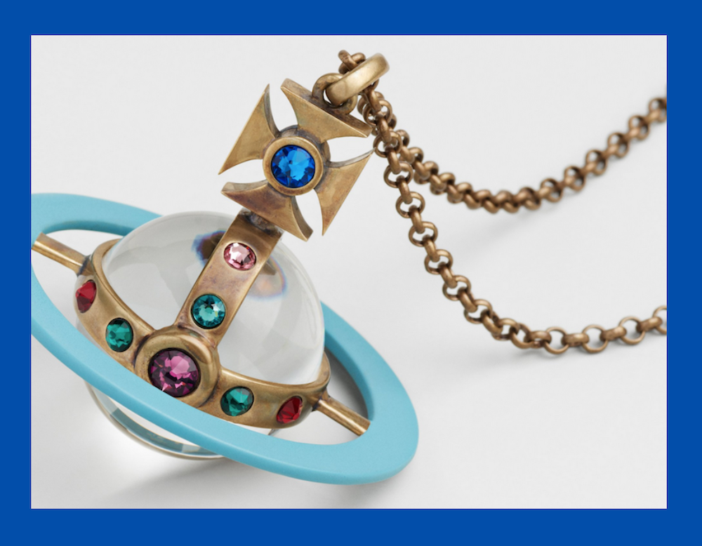
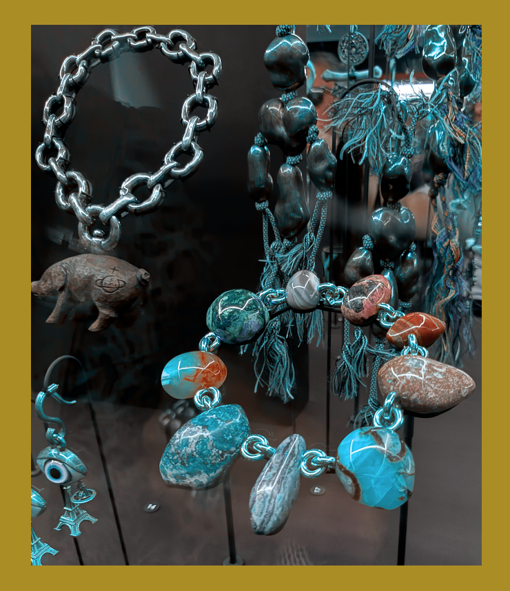
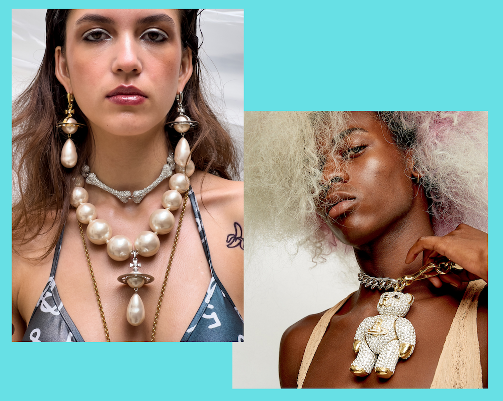
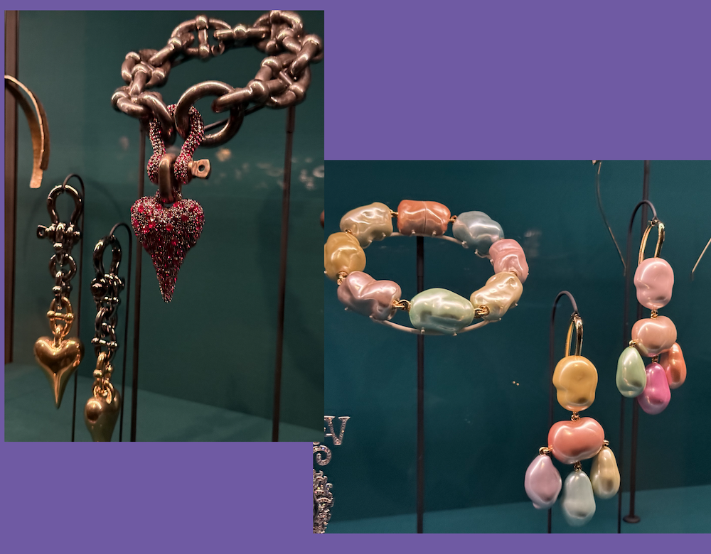
Vivienne Westwood, a name synonymous with avant-garde fashion and the punk movement, began her design journey in the early 1970s. Starting with a stall in London’s Portobello Road market, she revolutionized fashion by incorporating bold, statement-making jewellery into her collections. The exhibition at Te Papa showcases over 550 pieces of her jewellery. Each piece tells a story of innovation, rebellion, and artistry.
Curated Experience: A Walk-Through Decades of Design
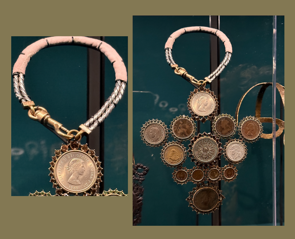
The exhibition is organized into separate rooms, each representing different decades of Westwood’s design evolution. This chronological journey shows the transformation of her style—from the raw energy of 1970s punk to the regal aesthetics of her later works. Eclectic pairings of jewellery, garments, and accessories are displayed against a backdrop of wall prints, sounds, and videos. I was mesmerized by the depth and variety of materials and components she used in her jewellery over the years. In many ways, Vivian redefined the very essence of jewelry-truly remarkable. While some designs might not “be your cup of tea” the reach of her ideas and depth of her design vision is undeniable.
Reflecting on Personal Inspirations
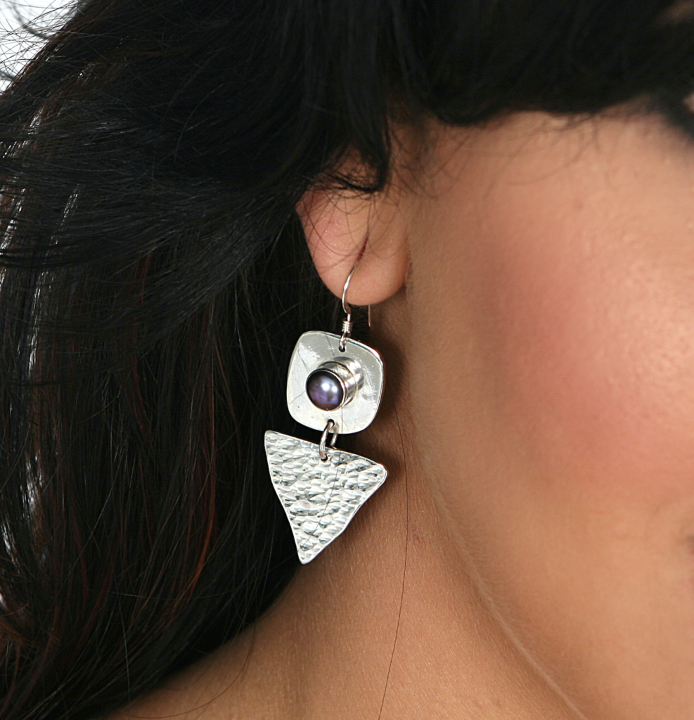
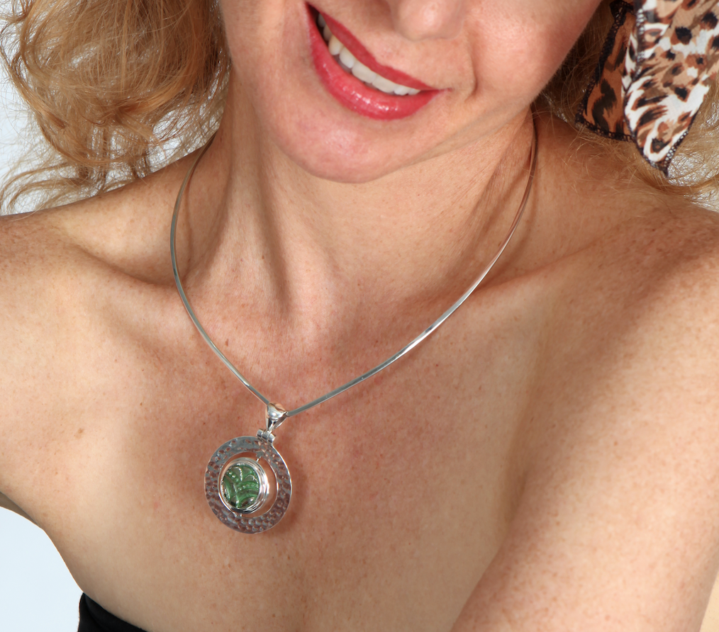
Walking through the exhibition, I especially loved the pieces that showed Westwood’s ability to blend traditional craftsmanship with unconventional materials. Many of her designs challenge conventional ideas of beauty and adornment, encouraging wearers to embrace their individuality. As a jewellery designer myself, this exhibition reminded me of the importance of pushing creative boundaries while staying true to my vision. The evolution of my jewellery creations began many years ago, with a small company I founded in San Francisco called: “Wild Thing Wearable Art.” Much later, Renée Blackwell Jewellery Design evolved and my creations matured into the one-of-a-kind pieces I offer on the website today. https://www.reneeblackwelldesign.com/ It was fun to see this evolution and “maturing” of Vivian’s designs as well, a progression from rebellious beginning to iconic elegance.
A Must-Visit for Design Enthusiasts
The Vivienne Westwood Jewellery exhibition at Te Papa is more than just a display of accessories, it’s a celebration of creativity, individuality, and cultural commentary. It’s a testament to Westwood’s enduring influence on the fashion industry and offers valuable insights for designers, jewellers and anyone who enjoys the glorious intersection of art, fashion and unorthodox design. The exhibition continues until the end of April 2025, then goes to Shanghai, China in Spring 2025. The tour also includes stops in Europe and the USA, with dates and locations to be announced.
And now, I’m off to my studio!